A “retrojet” plane
Pure Heart: The Evolution of the Southwest Corporate Logo
On June 18, 1971, a Boeing 737 “red bellied warrior” with the Southwest name took off from Love Field in Dallas, carrying its first paying Customers and launching a revolution that democratized the skies.
At a time when air travel typically was limited to elite “jet setters,” and airlines were introducing more class-based fare structures, Southwest was leveling the playing field. Its low fares; first-come, first-served mentality; and Fun-LUVing Attitude marked a departure from traditional airlines and helped define the Southwest business model. By the mid-1970s, Southwest had emerged as a true industry disruptor, but capturing the airline’s Heart in a corporate identity wasn’t a task for the faint of heart.
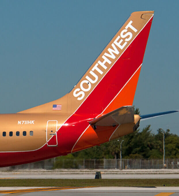
For its first 10 years, Southwest never formalized its corporate logo. But its identity was still unmistakably unique—from what were known as Hostesses (Flight Attendants) in go-go boots and hot pants to its desert gold, red, and orange airplanes. These planes were so much a part of the Company’s early identity that two Southwest planes today are painted desert gold as “retrojet” livery.
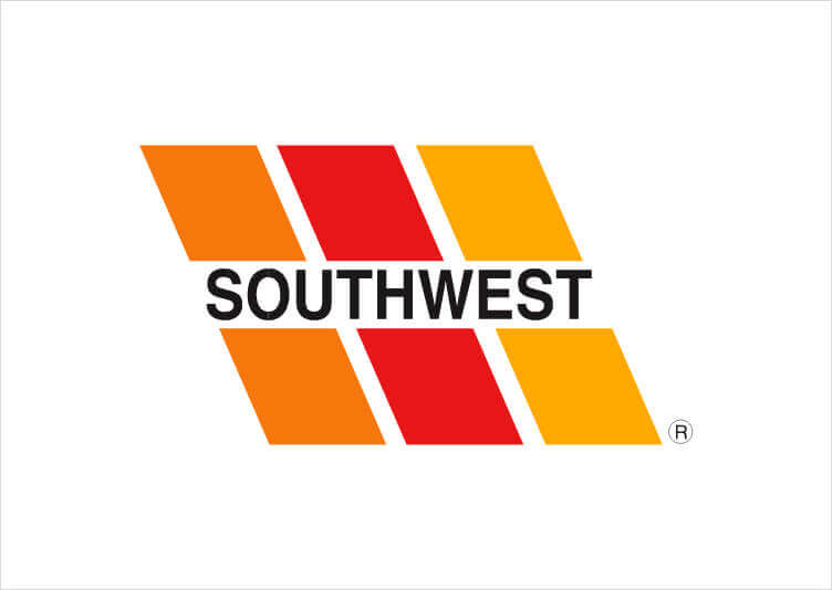
Although it didn’t become the official brand mark of the airline until 1981, the tri-color parallelogram had been used in one way or another since Southwest took flight in 1971. Inspired by a Ramp Agent’s uniform, the colors—orange, red, and desert gold—mirrored the paint on Southwest jets and were intended to create the illusion of an airplane tail in motion.
On its 20th anniversary in 1991, with the introduction of the “heart with wings” logo, the Company introduced the Heart that has since become synonymous with Southwest.
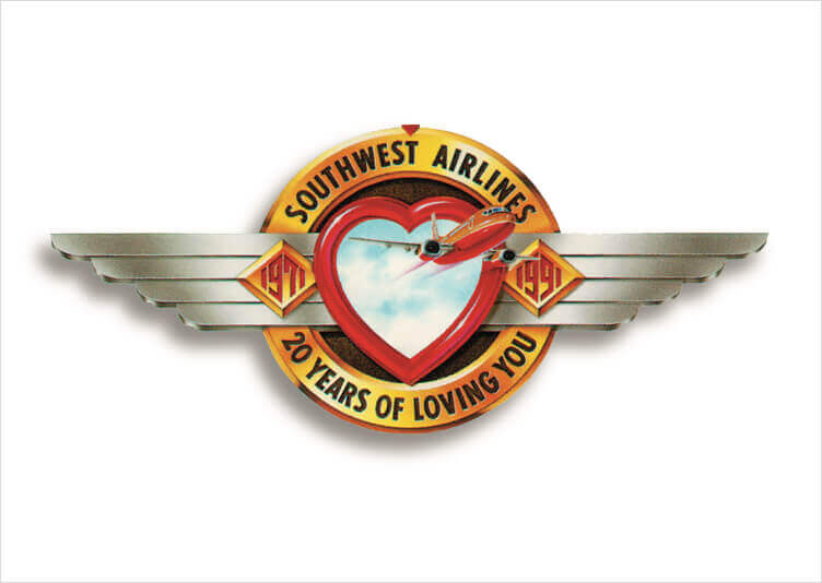
“The Heart, of course, is for LUV,” said Colleen Barrett, Southwest President from 2001 to 2008. The addition of wings was a given. “After all, we issue wings to first-time flyers and Unaccompanied Minors, and . . . Flight Attendants wear winged name tags,” she said. “When we decided that we were going to have an anniversary logo, it seemed natural that wings would be a part of that.” Even after the anniversary year, the wings stuck.
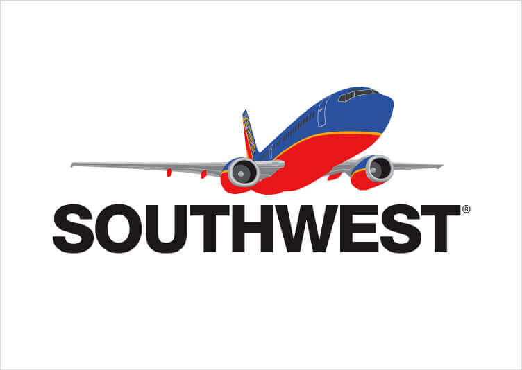
While it was never an official logo, the “takeoff image” became an important visual component of Southwest marketing in the 1990s and early 2000s. The Company had built its following around a brand promise that gave people the “freedom to fly,” so using imagery that reflected that sense of freedom was a natural extension of the brand. It appeared frequently in Southwest advertising and was featured in early iterations of the Southwest website.
The next evolution of the Southwest logo came in 2014—a big year for the airline on all counts. With the Wright Amendment finally repealed, Southwest expanded into big-time markets like New York and Washington, D.C., and added international destinations, as well. It also successfully integrated AirTran Airways into its operations. No longer the underdog of the 1970s, Southwest was ready for a brand identity that better reflected its status as an industry trailblazer and trendsetter.
Southwest assembled a creative task force to tap more than 40 years of the Company’s history in an epic evolution of its visual identity. The task, was to take everything Customers and Employees love about Southwest and turn it into a one-of-a-kind brand visualization.
Even as the identity evolved, the livery remained the same—with the bold brand colors reminding the world that Southwest isn’t like other airlines, and the Heart symbol on the belly of the plane conveying it as the airline with Heart and Hospitality. Every decision backs up the fact that the Values that put Southwest in the air in 1971 are the same Values that will take it into the future. The modern refresh stays true to Southwest’s DNA while incorporating bolder, more modern colors, reflected across all facets of the business: planes, airports, corporate communications—even snack packaging.
When it comes to the business of branding and marketing, Colleen said, “we must never allow the marketing of Southwest to be so strategic that we lose our heart and soul.” With the Heart as the emotional punctuation of the brand moving forward, Southwest reaffirms its commitment to keeping its Values and Culture at the core of its corporate expression.