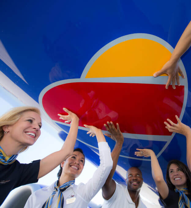
The Heart logo painted on the belly of the plane is one of the most striking details of the new livery.
Our Heart Livery
Southwest has never earned—nor sought—a reputation for operating airplanes that look inconspicuous on a runway. Over the years, the decision to select paint colors with names such as “desert gold” or “canyon blue” has, if nothing else, produced the most distinctive and recognizable airplane fleet in North America.
When it comes to designing Southwest liveries, there’s really only one rule: Go bold and drop some jaws or don’t go at all. Thus when Director of Brand Communications Helen Limpitlaw and a group of Southwest creatives and branding partners were asked to envision a new visual identity in 2013, they knew the depth of the challenge that lay before them.
More than a decade had passed since Southwest unveiled its Canyon Blue livery in 2001, which scored fashion points by adding a brilliant shock of blue to the carrier’s classic gold, red, and orange color scheme.
The time felt right for a refresh, as there was much to celebrate. Southwest was the largest domestic airline in the United States in terms of number of domestic originating passengers boarded. Its acquisition of AirTran Airways in 2011 was accelerating its push into international markets. And the Wright Amendment, which had long limited its flight options out of Dallas Love Field, was scheduled to mostly expire in 2014.
But how do you take one of the world’s most striking fleet of planes and craft a way to make them look even more iconic? The Team’s short-form answer: Be colorful and, above all, purposeful.
For many carriers, discussions over color palates were limited to which particular shade of white—cloud white, snow white, lifeless white—might work best as a background for its corporate logo. The general consensus? The more vanilla the better, as stark white planes tend to absorb less heat and cost far less to repaint than colorful liveries.
The key, the Team decided, was to embed its new livery with an extra layer of meaning. “Everything with Southwest (tells) a story,” says Helen. “We’re different, and we’re unique, and we celebrate that difference.”
Who else but Southwest, after all, possessed the sheer chutzpah to paint the bellies of its planes in a deep, vibrant shade of red? Not only did this longstanding color feature make Southwest “birds” stand apart from other commercial airplanes in flight, it subtly reinforced the point, often made by Founder Herb Kelleher, that Southwest possessed plenty of Warrior Spirit and competitive fire in its belly.
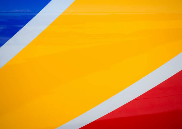
The chosen colors of the Southwest Heart: Bold Blue, Summit Silver, Sunrise Yellow, and Warm Red.
The new livery design would need to subtly deliver a message that Southwest Employees could both feel and rally around. After discussing dozens of designs with its marketing Partners and holding focus groups with Employees across the Company to vet each, one in particular seemed to jump off the page.
It called for the use of a deep and vibrant blue—fittingly named Bold Blue—to cover most of the plane. This striking blue would be broken only by the placement of the word “Southwest” in white on the plane’s body as well as bold stripes of Sunrise Yellow and Warm Red candy-caning off the back tail onto the rear of the plane. The color orange, after much debate, would be retired, replaced instead by a thin stripe of Summit Silver dividing the colors on the tail.
As striking as the design looked, it was the symbolism behind each color choice that gave it extra dimension. The silver, a precious metal, honored the Company’s business and longstanding Customers. The Bold Blue expressed the Company’s commitment to the spirit of exploration and ascending to new heights. The Warm Red symbolized its Warrior Spirit and emphasis on Customer Service. And the Sunrise Yellow, bright as the dawn, signified the start of a new chapter in the Company’s history.
And if those color choices weren’t meaningful enough, the design boasted one more crucial storytelling element. This new livery introduced a subtle new insignia: an eye-catching Heart logo striped yellow, red, and blue.
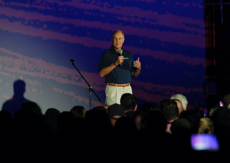
Gary Kelly prepares to unveil the new Heart One Livery.
Early in the design phase, this insignia was referred to as a “punctuation Heart,” as it could be used as a surrogate for the period in Southwest.com or slipped behind the word Southwest in what would become its new logo. But the Heart proved to be a critical element for the aircraft design as well. It replaced the distinctive red previously painted on the undercarriages of Southwest planes, and also appears inside the main cabin and beside the main cabin door on the exterior of each plane.
“When you see it by the door, when you walk into the plane, we were welcoming you into our home,” says Helen. “But the smallness of it really (spoke) to our humbleness, our authenticity, and our care.”
When Chairman and CEO Gary Kelly, who was also President at the time, was presented with the design in early January 2014, he was immediately drawn to it. Given that Southwest has always prided itself on being an airline that wanted to show Heart in every single thing it did, it seemed appropriate to fly a fleet of planes that quite literally wore a Heart on its sleeve.
Scores of Southwest Employees flew to Dallas for the livery’s official unveiling on September 8, 2014. In typical Southwest style, it was quite the event. Inside a dark aircraft hangar, a high-tech projection system beamed a video presentation onto giant screens. It slowly unveiled the design elements of the new livery with the Heart symbol on the undercarriage. Then, the hangar doors were opened and attendees rushed into the sunlight to find a plane painted with the new livery parked on the runway and a second soon flying overhead.
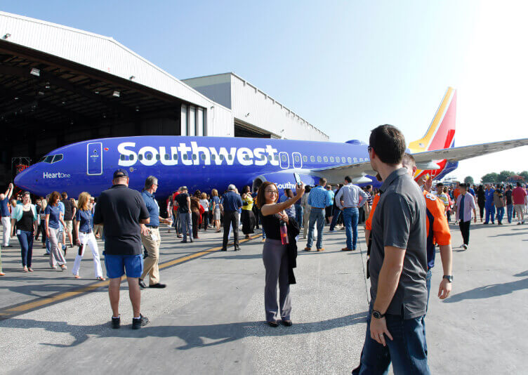
Southwest Employees at the 2014 launch event get their first look at the new livery.
“It’s not a new Southwest, it’s an evolved Southwest,” Gary announced to the press in a series of interviews to follow. But the real joy came later, as greater numbers of Southwest Employees were invited to get up close and personal with the newly painted planes.
Their reaction, as to be expected, was overwhelmingly positive. Most were instinctively drawn to take a look at the Heart painted on the belly of the plane. Many raised their hands to touch it, knowing in their Hearts exactly what it meant—and that the next chapter in Southwest’s exciting story was about to begin.